
Red Dirt Chica
Red Dirt Chica is a fictional western inspired, women’s clothing boutique. With the combination of a little grit and a little glitter, this is the boutique for every kind of southern girl. Pulling inspiration from red dirt roads and deep southern Texas culture Red Dirt Chica has a very unique style and flair.

“You’ll never do a whole lot unless you’re brave enough to try.” -Dolly Parton
The Challenge
To design a fictional brand or company from scratch. Complete branding for the company. Designing a logo and supporting products to pull the brands identity all together. There are no parameters or guidelines to follow for the content to what kind of brand is to be designed.
Main Objectives
Branding
From my research many women’s western boutiques are very corporate and have a broad array of styles. Smaller boutiques are harder to find and can never find exactly what you need. This is where Red Dirt Chica can fit right in the middle.
Typography
Designing for Red Dirt Chica’s brand it needs to have a very distinct and unique style to stand out from other similar western boutiques.
Advertising
After completing the company’s branding, the challenge still stands of how is this brand going to be marketed and advertised in order to make money.
Initial Direction
For Red Dirt Chica, my initial direction was to go down a space cowgirl style. With very bright colors, with hot pink and turquoise. I wanted to include lots of shimmer and sparkle like the aesthetic of a space cowgirl.
To get inspired I watched a lot of western movies, like McClintock and Tombstone. These movies put me in the headspace of what the whole wild west meaning is. The neutral color palettes from the dirt roads and mountains are what I pulled inspiration from for the Red Dirt Chica logos.
This also helped me settle on typeface choices. The combination of grit with a feminine touch helps bring this brand all together.
Moodboard and Sketches


Digital Drafts
After creating my moodboard style direction and sketches, I created multiple versions of possible logo designs. Mainly focusing on word marks I felt like this would be best for the Red Dirt Chica Brand. Playing with girly peachy pink tones as well as earthy neutral tones to compliment each other in the logo.


Final Solutions
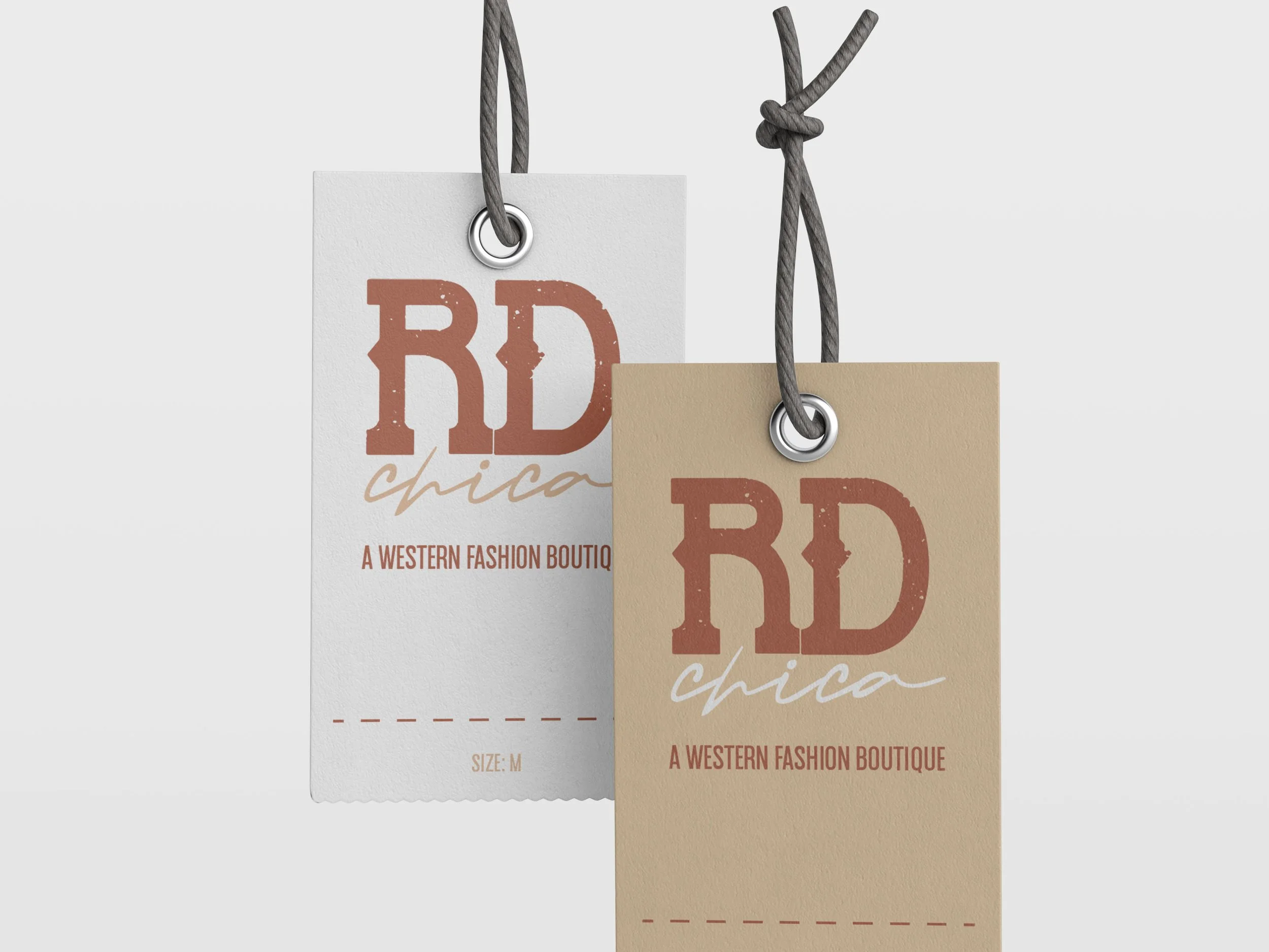
Seeing all of the possible logo designs for Red Dirt Chica, I went with a western eroded typeface mixed with a girly handwritten cursive font. I believe these two typefaces bring the logo and brand together. I have fully written out word mark for the primary logo and the two initials “RD” as the secondary logo mark.


Reflection
This project is one that I hold near and dear to my heart as a southern girl. I have always been inspired by the wild west and being able to create a brand from start to finish with this aesthetic and theme made it so exciting to work on. I do feel that there is room to improve and make this brand stronger.